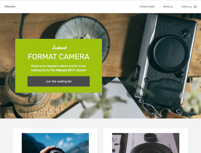
fine hypertext for your viewing pleasure.
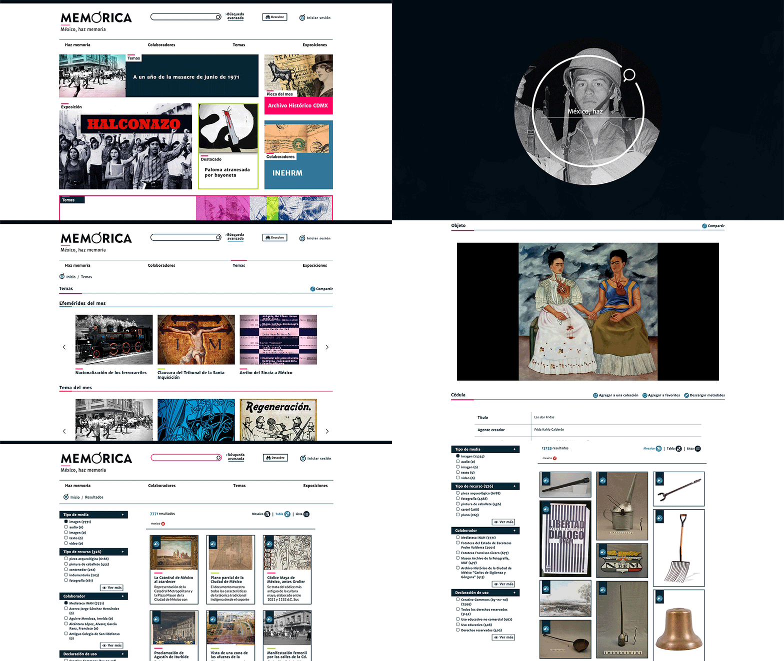
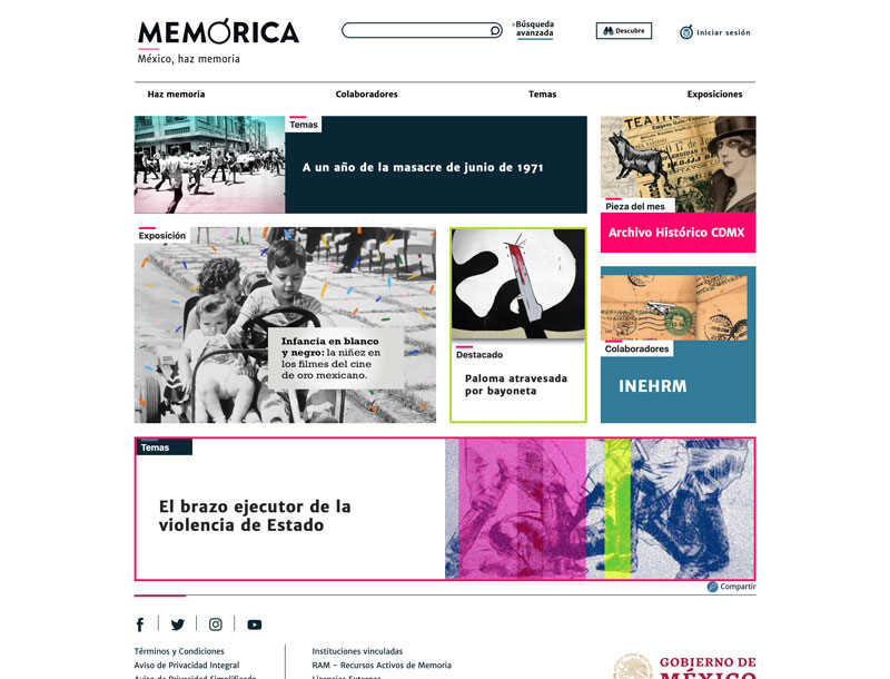
Memórica México
This is without a doubt the biggest project I've ever been a part of. Memórica is a self described open access library that houses digital reproductions of old documents, photographs, paintings and other stuff related to the history and cultural expressions of Mexico. I saw this project from its inception. I helped with the design aspects, information architecture, UX design, front-end development, maintenance, you name it!
Check it out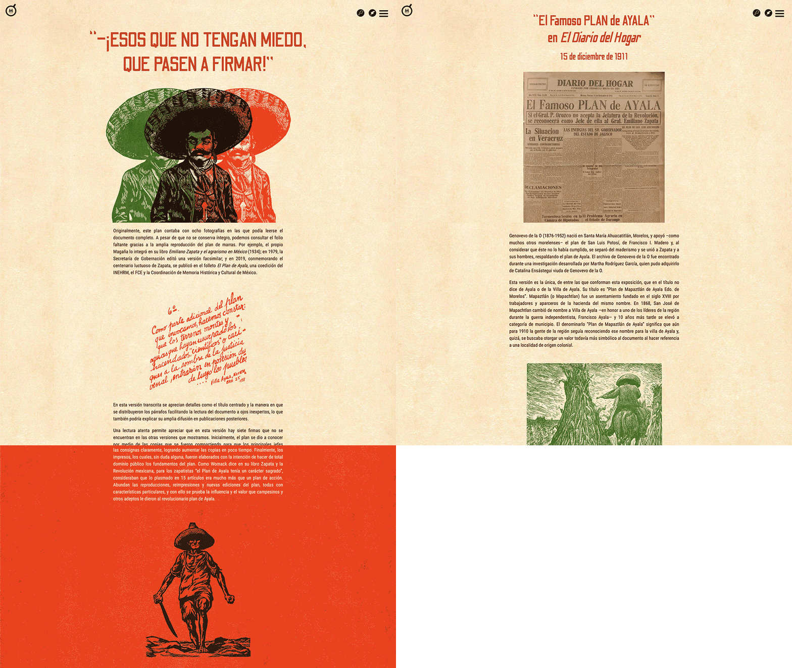
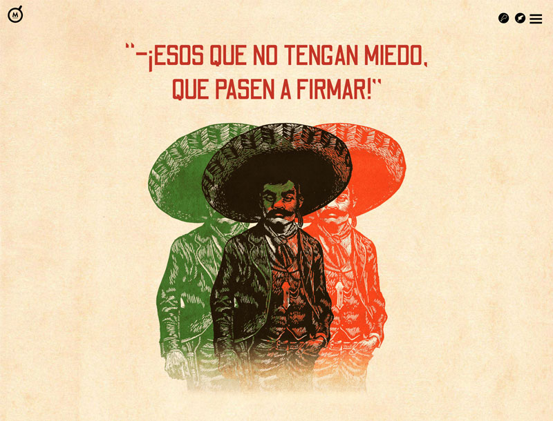
El Plan de Ayala
The first in a series of "digital exhibits" I made to commemorate historic events within Memórica. The ones I made took great inspiration in the works of Epic Magazine. Huge splash screens, text in a single column and big striking visuals. I think I did okay. Visuals were made by me, and also all the programming (except the bit at the end where you can compare different versions of the document, that was made by someone else).
Check it out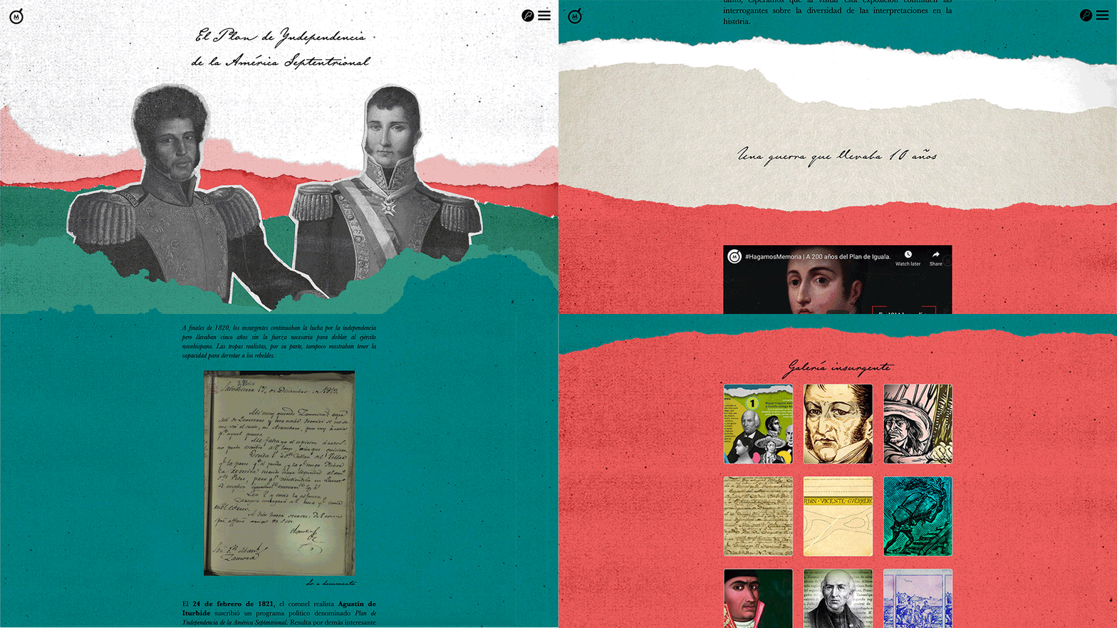
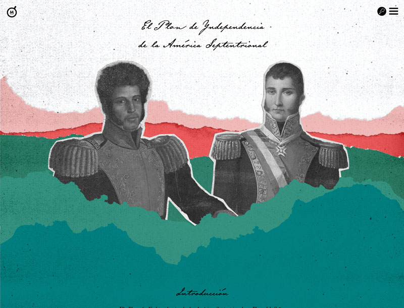
El Plan de Iguala
This is another digital exhibit that I made for Memórica. In keeping with the same theme as the last one, this one too has it's own brand, and again I worked on the design aspect as well as the programming. Everything's pretty standard-issue: fixed header after a big intro section, fullscreen overlay menu screen, rotating hamburger button and some JavaScript here and there.
Check it out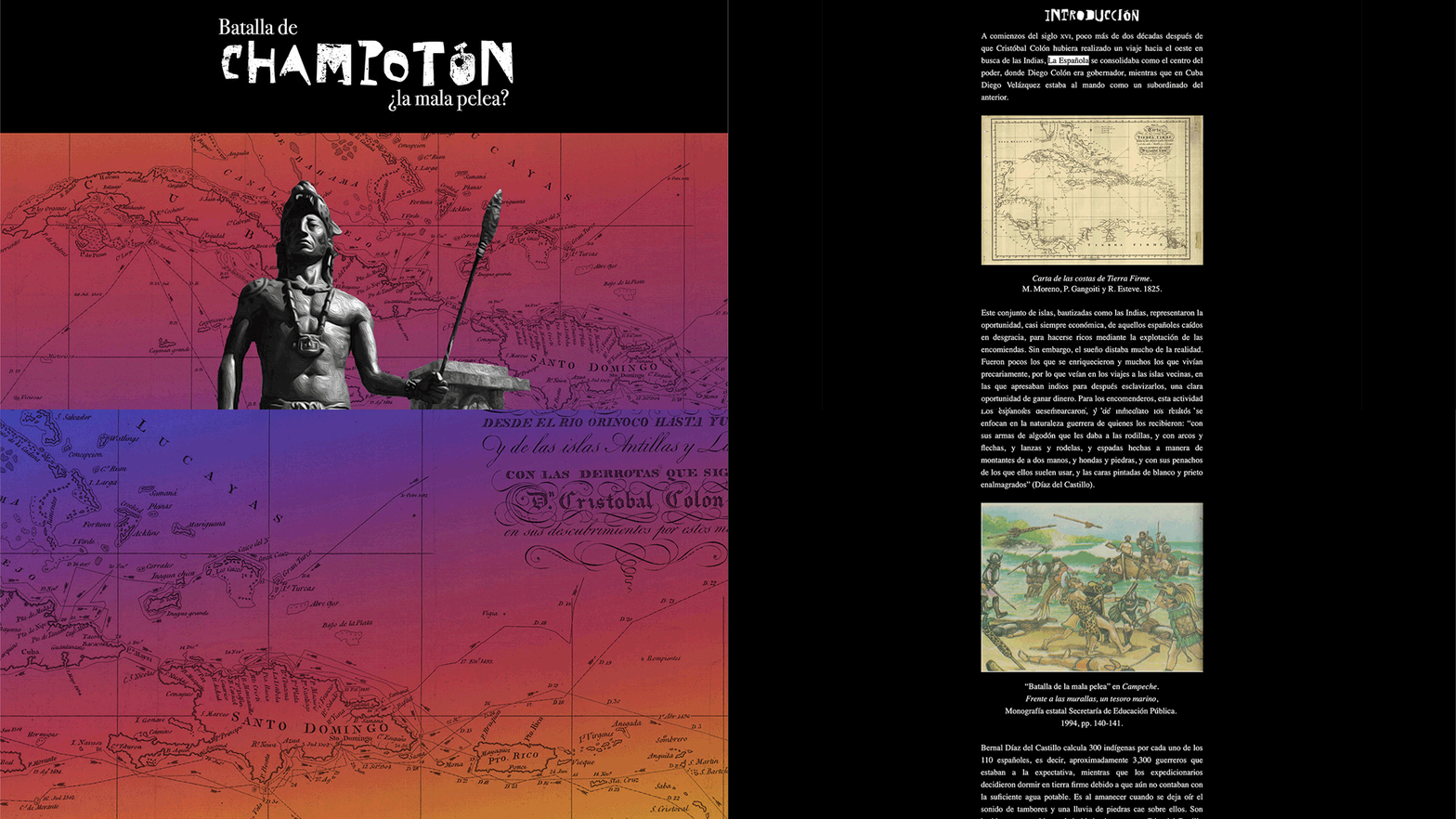
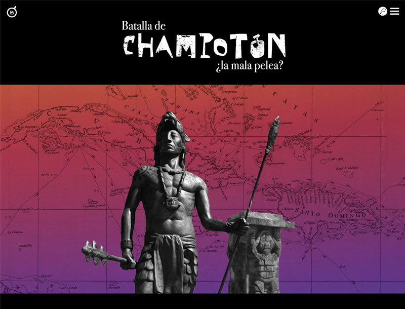
Batalla de Champotón
The last of the digital exhibits I made while working in Memórica. This one's a bit of a director's cut because the one that ended up being used on the site strayed a bit far from my original vision. Again, nothing particularly complicated, the splash design was inspired by an old Yma Sumac cover. Sometimes inspiration can come from the strangest places.
Check it out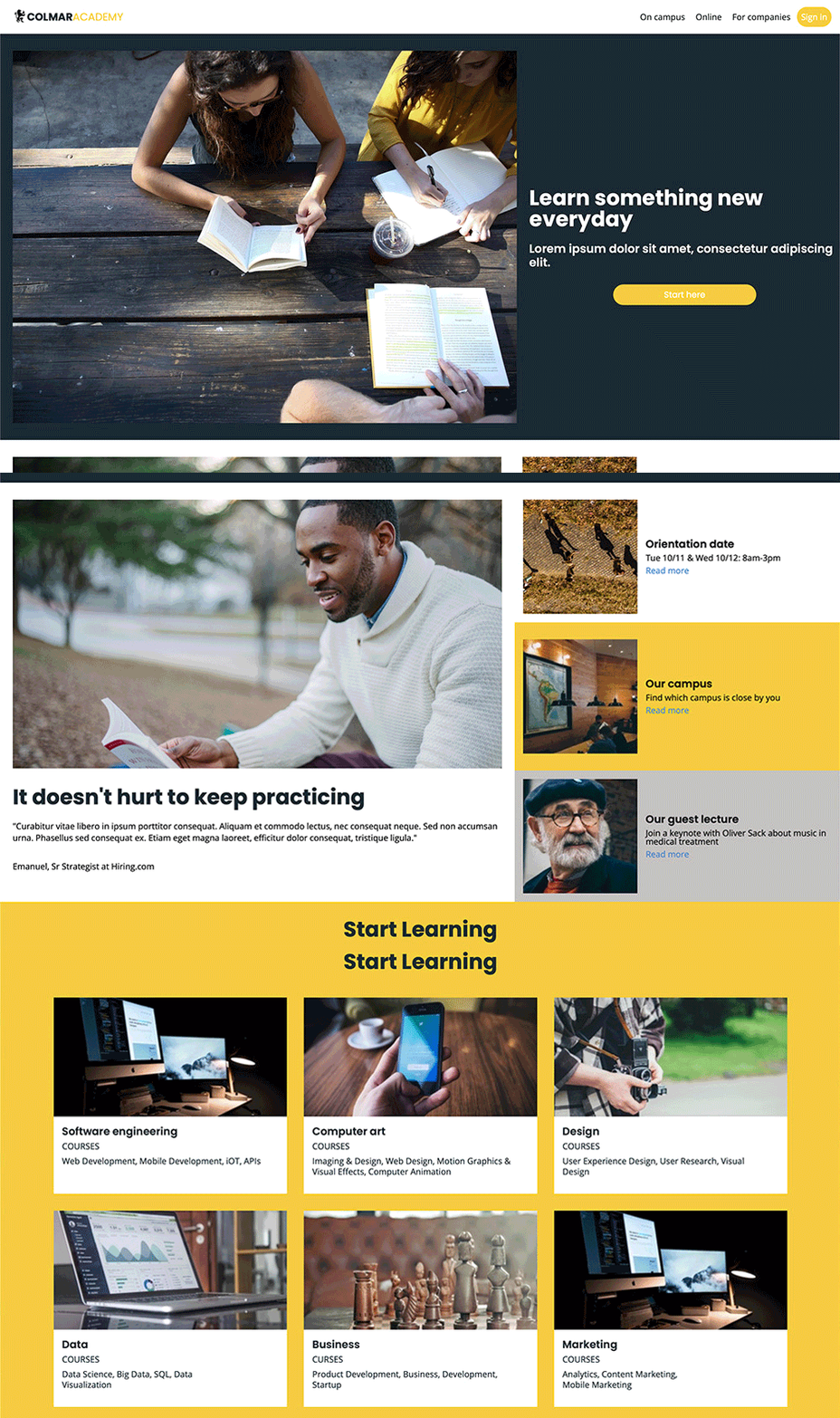
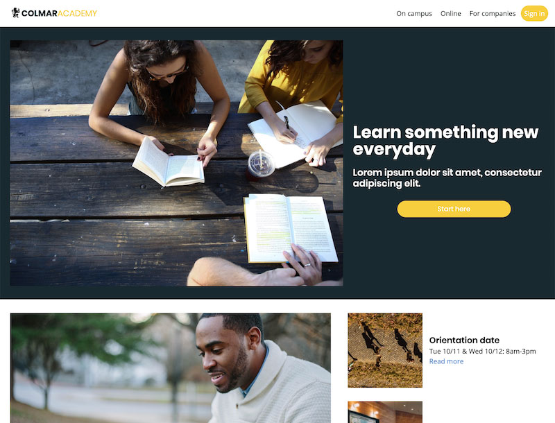
Colmar Academy
This was my final project on my Codecademy course. The website uses special media queries to display different versions of the same site depending on the size of the display you use. I believe you kids call it "responsive design". Go ahead, give it a try. Just resize your browser window!
Check it out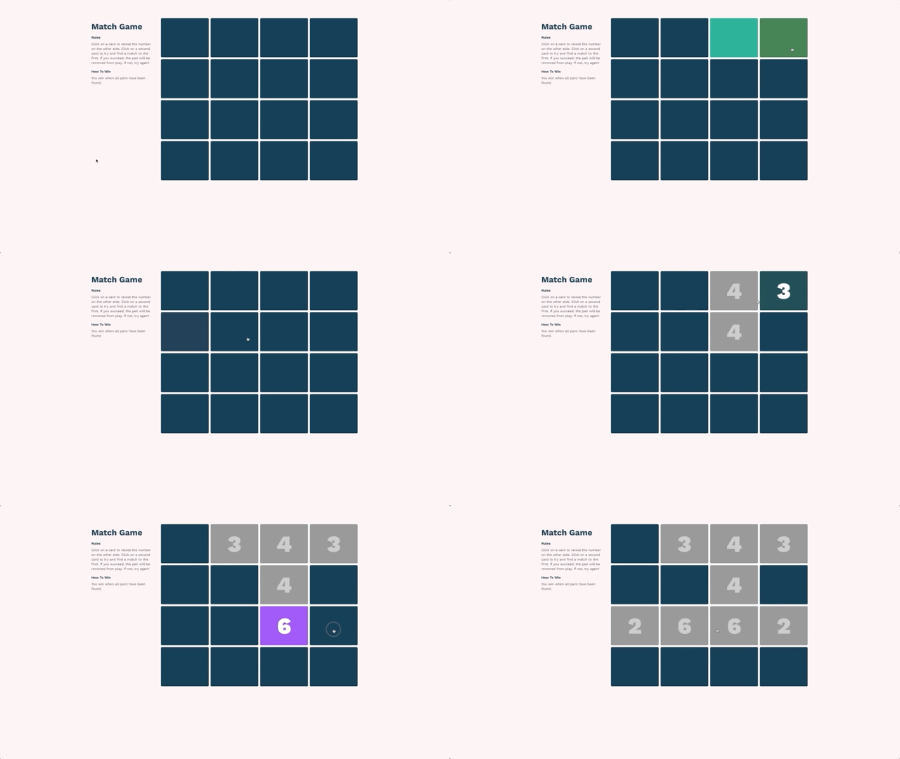
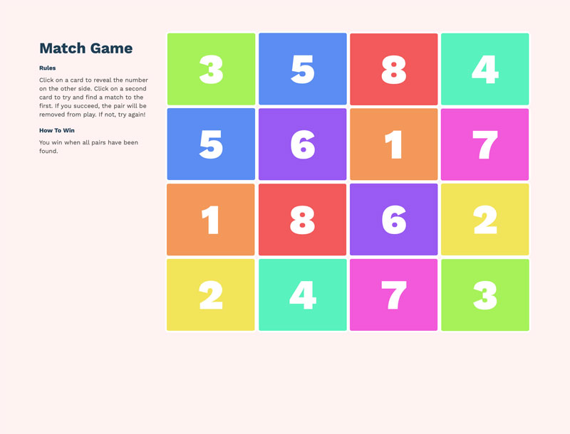
Match Game
This was probably the hardest Codecademy project I can think of, but it was very rewarding in the end. It's a card matching game that uses JavaScript logic and jQuery event handlers. The game generates random positions for 8 pairs of cards and you have to match them. See if you can match all the cards!
Check it out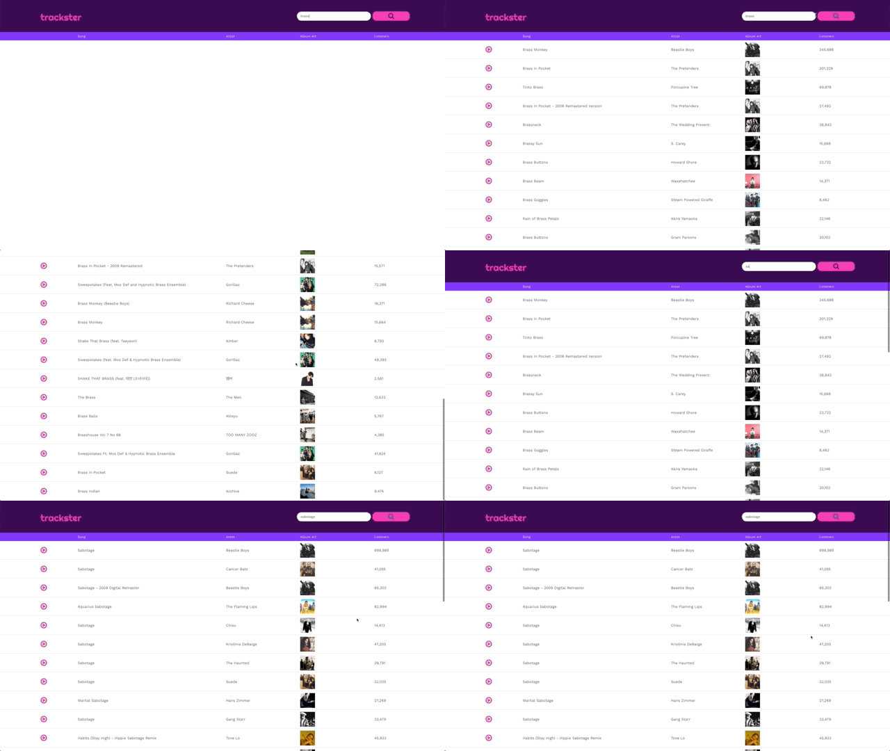
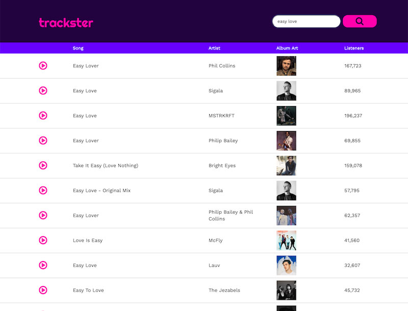
Trackster
Trackster is another cool project I did on Codecademy. Trackster is a music searching and sorting app that uses JavaScript, jQuery, Bootstrap and the Last.fm API. Just write the name of any song in the search bar, hit enter and let the site do its thing! It's like magic!
NOTE: Changes to the Last.fm API have blocked all the album art from being accessed by third parties, so now all of the tracks just have a generic album cover. Bummer!
Check it out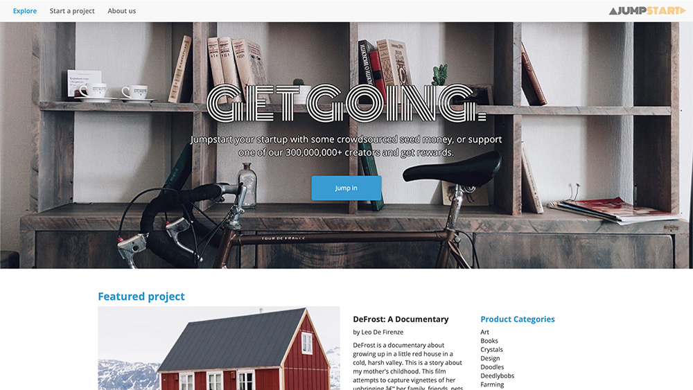
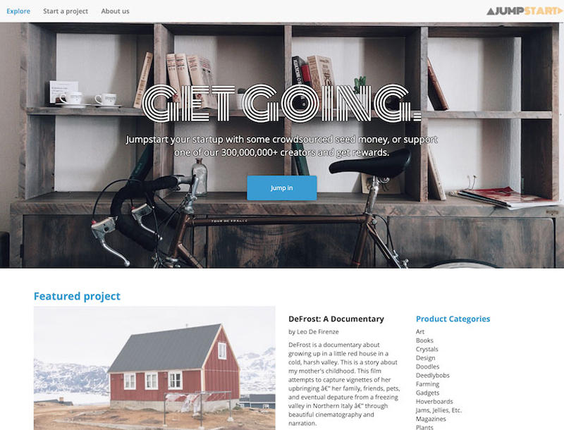
Jumpstart
Welcome to Jumpstart! A fully interactive responsive landing page for a fictional crowdfunding startup company done with JavaScript, jQuery, and Bootstrap. Looks a bit simple, but as always the devil is in the details. The site welcomes you with a nice looking carousel and some other animations hither and thither. Then I added some fins to lower wind resistance, and this racing stripe here I feel is pretty sharp.
Check it out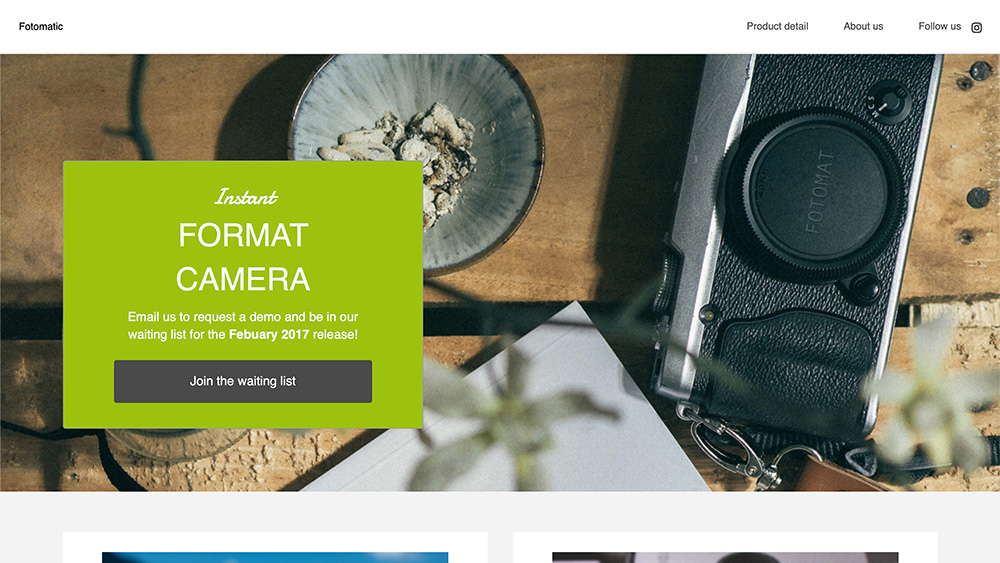
Fotomatic
Another Codecademy project (most of them are). This excercise consisted on starting from a broken website and fixing all the bugs. So it was like building a website but in reverse. This is another responsive website as well, and a cool excercise as well, since looking around for errors can also be a difficult thing to do!
Check it out